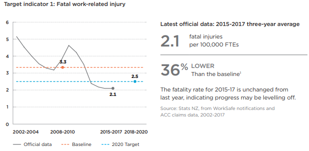
The NZ Working Safer Vision sets accident statistics goals for reduction of fatal and serious work injuries. But raw data from the Worksafe website shows no significant improvement in the simple number of deaths. 2013: 57, 2014 44, 2015: 45, 2016: 50, 2017: 50. This is because..
…the accident statistics get adjusted
The calculation of baseline accident statistics came from the average figures for 2008 – 2010. The Pike River 29 were excluded. Those accident statistics and the monitoring of subsequent accident statistics are adjusted using a mind-boggling formula. It’s called “Age-Standardised Rate per 100,000 Person Years”. This is consistent with international practice, if a tad hard to get your head around.
 The improvement goals were: 25% reduction in “fatal” and “serious non-fatal” work-related injuries by 2020. And an interim target of 10% by 2016. Using this, NZ has already bettered the goal for 2020 for fatal injuries. The “serious non-fatal” situation is more sketchy. The 2020 goal was achieved in 2016, but a poorer year in 2017 caused a nasty little kick upwards again. But it’s still 11% lower than the baseline, so, in theory at least, “on target” for 2020.
This is a complex calculation. To get accident statistics we can compare with the rest of the world, there is an adjustment for a “standard population”. For example, “mature” countries, like European ones have populations at the older end of the age spectrum. They have a higher proportion of retired people, who are not in the workforce. And “newer” countries have a higher proportion of younger people.
Having converted the data to a “standard population”, the accident statistics are given as a rate per 100,000 person years. In other words, exposure time. This is important to adjust the fact that countries with more people would have more injuries in total.
Pros and cons:
Pros:
- More accurate international benchmarking;
- Better measurement of longer term trends;
- Scientists, statisticians and safety experts can have a common language.
Cons:
- In theory, you can have more injuries than before, but show an improvement;
- The average person has no idea what it all means;
- Hard to see a direct relationship between actual events and the result.
Accident statistics and road deaths in NZ
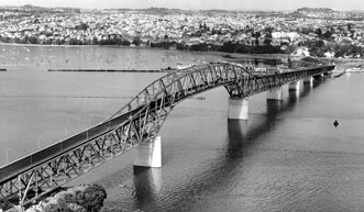
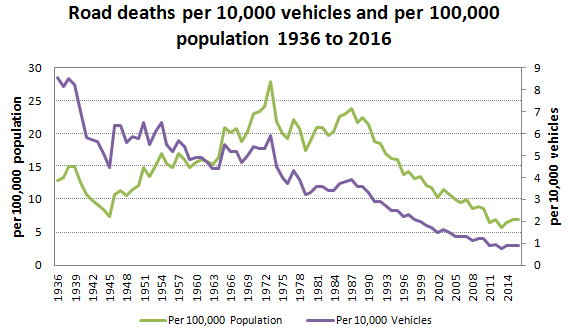
 Contrast the above methods with the type of conversations we see regarding the National Road Toll. Agencies, including the Police, steadfastly refuse to use adjustments for more population, more cars or more kilometres. We are emotionally told that “This year’s deaths are the highest since Year X, (when we were all driving Austins and the Auckland Harbour Bridge had 4 lanes)”. So the underlying rationale is clearly that we are being rallied to support “the cause”. We must never let technical things like population or kilometer-adjusted rates deflect our evangelical purpose. “There must be no excuses”.
But if we had a 9.6 million population, instead of 4.8, our road deaths would be approximately double. The rate would, however, be the same. Most people “get” that.
Internationally, road death comparisons are available that use rates like:
- road fatalities per 100,000 population;
- road fatalities per 100,000 motor vehicles;
- road fatalities per billion kms.
NZ is already represented in these lists. And all the relevant NZ agencies must have those figures over a period of time. They will almost certainly show that NZ is improving. I found a one-off World Health Organisation report (below), but haven’t yet been able to find out trends over a period.
But we don’t talk about this comparable data publicly. The agencies are obsessed with reducing the actual number dead in a year. And, Ye Gods, the all-important Easter Weekend! Meaningless but highly emotional.
So we just continue to get dismal adverts showing drunk drivers dying in ditches. Official commentators will send out the same ineffective exhortations which include the criticism that we are all arrogant toads on roads. And yes, too many of us still are. But we need something different.
Some comparative data on road deaths
Here are the sorts of facts we could benefit from if we used properly adjusted road accident statistics. The source of this is a Wikipaedia page which is an updated version of a WHO report on global road accident statistics as at 2013.
 We’re not that flash compared with Europe and some other developed nations, but our road death rate (2013) was 29th out of 188 countries at 6.0 fatalities per 100,000 of population.
- That was just a little better than Italy at 6.1. Not that being slightly better than Italy is anything to shout about. Much as I love Italians, their driving is, let’s just say – breathtaking.
- Some others worse than us that may surprise you: Belgium, (the centre of the EU) at 6.7; Luxembourg 8.7; Poland 10.3; “The Land of the Free”, USA at 10.6; and for anyone who’s ever watched dashcam footage on YouTube, Russia at 18.9, perhaps unsurprisingly.
- Among those with a better rate than us: Australia 5.4 (possibly some ball-tampering there); France at 5.1; Germany 4.3; Ireland 4.1; Spain 3.7; Netherlands 3.4; UK 2.9; Sweden 2.8. (These are just a selection).
Switzerland and Norway seem to have been allowed 2016/2017 updates to be listed, and therefore come in with 2.6 and 2.2 respectively. But I’m ruling them out of the top spots because all other nations’ stats are 2013, so they can’t leapfrog old data in my book.
I have also ignored some anomalous zero stats from small nations or island nations such as Monaco and Micronesia. (Monaco because no one ever admits to crashing a Ferrari and Micronesia because it’s a little place with few roads or cars).
Leaving aside my somewhat mischievous analysis, I hope I’ve made the case for comparative accident statistics. Because right now, we are looking forward to another holiday period. And TV news will focus on doleful Police traffic managers standing on motorway bridges, agonising over the fact that the toll is “already 6 ahead of whatever was the best year on record, and that there’s still two days to go”.
It’s all a bit daft..
But what if we “plugged in” to internationally recognised road accident rates, just like we have done with workplace injuries? We may confuse a few people who will never understand that stuff, but we may also be able to move away from this one-eyed obsession, to a more objective, globally comparable set of data. Then we can stop the irrational jabbering. It’s time to view road accident statistics with cool heads so a measured, informed approach can begin.
Simon Lawrence
Simon Lawrence is Director of SafetyPro Limited.
Consulting for safety.
- Call 0800 000 267 for a welcoming chat, or email simon@safetypro.co.nz
Check out our SafetyBase software
- View a 4 minute video overview. Please like or share.
- Browse the SafetyBase website.
- Short cut to the all-important Pricing Page. No hidden costs.
- Download a PDF Fact Sheet to show to your Senior Leadership Team.
Call me, Simon, on 0800 000 267 or email simon@safetypro.co.nz You could be trying out this highly effective health and safety software system in minutes.

